‏הצגת רשומות עם תוויות ממשק משתמש. הצג את כל הרשומות

יום ראשון, 15 בנובמבר 2020

Lessons learned about user experience and product development in the last decade

Working with superb developers and designers in all kinds and shapes taught me a lot. I would like to share a few key mindset changes great developers go through in order to design better products. This article is written from different aspects of the product dev cycle: design, plan, prototype, develop, user testing and QA.

1- YOU DON'T NEED ALL OPTIONS ON SCREEN AT ANY GIVEN MOMENT.

Even when you make a complicated system dashboard, the user has different tasks or questions they wish to find out at any given moment. Make sure you place only the information the user really needs at that specific situation or state.
" Place only the information the user really needs at a specific situation

Think of the product as you think about code: each section should be simplified to do one functionality as simple as possible. When you have parts of the product that can stand for themselves, consider dividing them apart.

Lets take for example an online mobile shopping app that offers taking a picture of a product's bar-code and gives back more details. That functionality is not something to be embedded inside the dashboard, rather it is a separate part of the product, presented in a separate screen.

An overly complicated screen and sayings like "my users must have this" or "we must have this with easy access" is the easiest identifier that you have a problem in your product's UX.

How to get better?
You would need to know who your users are, what they wish to do, what is their problem and how they solve it nowadays with other solutions. And that's where our second principle comes into place.

2- LET YOUR USER FEEL AWESOME ABOUT THEMSELVES.

We humans want our pains to go away. We want to enjoy our time here. And we don't need extra trouble, because we already have enough...  Now, app developers and entrepreneurs might think that what they are building is the best thing humanity has seen. But let me break some news to us all - people don't really care...

The only thing the user will care about is solving their problem efficiently and as fast as possible. If you can do this they would be thankful. If you could do this and let them enjoy from the way, that would be much appreciated. But this is the only way you can make the user care about you. 
"Do everything you can to solve the user's problem as fast and efficiently as you can

A happy and satisfied user is a talking user. Word-of-mouth is the best marketing strategy you can wish for, and that should be the only explanation why you should strive to satisfy your audience. 
But marketing agents usually take this idea one step too far. Because satisfying your user doesn't mean that you have to do what the user asks you to, rather do what they need you to. That is where user research comes into place.

Alan Cooper, the inventor of the Personas, once said that if you can do all that while letting your user believe that they worked that magic themselves- you will become even greater. In Instagram for example, the user believes that they are the ones working all the magic. No one cares or thinks about the effort that was placed into designing such a wonderful technology. But the most important thing happen, it went viral very fast.

How to get better?
Get to know your users by interviewing them on a coffee. Find out their real issues and struggles with existing solutions or shortcuts they found to overcome. Design the interaction flow that would solve their problems better.  

3- DESIGN FOR THE USER FLOWS AND TASKS.

Once you know the tasks the user wishes to perform with your tech, design the steps.

Design one task at a time. Separate the tasks. Make sure steps are well defined.

Offer checklists, breadcrumbs, or other measures to educate the user about the process of execution they are required for.

4- great products don't have a tutorial

if you need a tutorial (or a manual, or documentation) to start using the product, it is a sign of complexity. If you feel your product doesn't work with explanations, and believe that tutorials or step by step instructions will solve this issue, you are addressing this the wrong way.

Even though you might be right, and some sort of instructions will help the user achieve their goal, this will slow them down, and they will not be happy about the fact that they needed help.

Often the need for tutorials identifies a flaw in the product itself. Maybe the process or flow is now defined in the rightful order; perhaps the language used in the UI is not understandable by the user.

Remove the need for explanations will simplify the use and fasten the results.

The way to do that is get to know your user's vocabulary and right track of doing things.

5- watch user testing sessions

You can let others do the user testing for you, but don't give up on watching the tapes. If you can keep quiet, go watch it live. You can give the facilitator notes during the session (if it's really important) or feedback them between each sessions.

Doing this will equip you with the powerful feedback of how users approach the product. In the first time, you would think "this user is stupid", or "they are not the right audience". But after 5 or 10 people you would realize that the truth is that something is not working properly , and we did something that caused that.

6- don't waterfall your agile methodology

The purpose of agile method is to allow easier and faster change. If you know something must change and you will get to it in only 4 or 5 sprints ahead, "just one more release , and then we could handle this issue"- that's not good.

7- talking to designers


8- when do you need more testing?

רעיון מנחה שיכול לעזור להחליט מתי כדאי להפסיק לחשוב על רעיון לפיצ'ר חדש ומתי אפשר להמשיך לפתח את המוצר.
אם הבנת שיש בעיה במוצר או בתהליך או בהבנה של המשתמש את התהליך, (קודם כל תרשום אותה ביחד עם שאר הבעיות).
אבל עכשיו עלה לך רעיון איך לפתור את זה. ואז אתה בא להתחיל לכתוב את הקוד ופתאום יש לך עוד רעיון לדרך נוספת. ברגע שיש לך יותר מרעיון אחד כיצד לפתור משהו (ואתה צריך להתאמץ כדי לנסות למצוא כאלה לפני שאתה כותב), תחשוב מה יותר טוב בראי המשתמש. אם אתה לא מצליח להחליט לבד בצורה ברורה ומשכנעת, זה אומר שחייבים לעשות בדיקה על הסוגיה הזו.


Design recommendations
. When people see your product and start consulting or suggesting features, the product probably works. 
If they stay silent, or don't respond - it is probably because they don't understand something, and therefore the design did t work well.


. Design at least 2 solutions for the same problem. That would help you better evaluate both solutions without being attached to one in particular


יום שני, 2 בינואר 2017

Material Design Assests

אז אחרי לא מעט שנים שהקונספט החדש של google לעיצוב קורם עור וגידים, מצאתי אתר מקיף שמתכלל את כל החומרים השמישים עבור מפתח WEB ואפליקציות בנושא Material Design.

האתר כולל הכל, החל מאייקונים, לאתרים לדוגמא, פאלטות צבעים, best practices איך לעשות ואיך לעצב, תבניות עבור ניידים וגם עבור אתרים.
יש כאן מספיק מידע גם למעצבים וגם למתכנתים.

אז בלי תירוצים ואין סיבה שהאתר או אפליקציה שלכם לא תראה טוב!
http://materializecss.com/

יום שבת, 3 בדצמבר 2016

Contact lenses that will change our lives

from Innovega-inc.com
In 2009, when I tested my first big Augmented Reality project on real users (ARIE), they said it was too heavy (and that was only a relatively light-weight glass-wear). We thought then, that only something as light as a contact lenses would be accepted by real users for long term use.
Augmented Reality Instructions Editor, Gady Yosef & Shachar Oz, 2010

Well, even though the technology isn't available yet, we are getting closer and closer.

Innovega has been working on the design for such a device in the past few years. This prototype was shown at CES 2014: contact lenses with a screen inside it.
By Innovega, 2014 (video)


Both Goggle & Sony are very active in that field, and are writing patents in the past few years, especially since the Google Glass experiment failed. I am certain that other giants are working on such technology, and my uneducated assumption is that in a decade from now  we would see  a live demo of such a prototype.


Devices as this will extremely revolutionize the way we live and communicate. When designed right, Augmented Reality is a technology that could be used by non-techy users. As an  example, it could offer automatic real-time translation of texts (Word Lens was acquired by Goggle and joined Translate app). Another use case is a virtual fitting room for new cloths before actually wearing them. A few days ago, Metanoia Interactive showed an option to design your future home in VR. This use case is also being developed in AR as well, by others.


But, we should first worry for our safety, as these devices are also very invasive.
Black Mirror chapter The Entire History of You, as well as the short movie Sight from Bezalel design students, and also Hyper Reality (by Keiichi Matsuda)  -  all showed some misuse of such devices.
Sight, short video, 2012

Hyper Reality, short video, 2016

As a society, we should embrace change and innovation, but be ware of possible consequences and outcomes of new technologies.

I recommend to form a committee that will approve such devices, technologies and developments. A group of scientists, sociologists, educators, judges, doctors. A group that would only care for our future as a society and not as a hungry startup or poisoned government.
Most important- this group should be formed quickly, for technology will come upon us.

I believe in technology and I believe in change. But we must also make sure radical and revolutionizing techs will not destroy our society.

יום חמישי, 15 בספטמבר 2016

הטלפון שלך יכול להיות המחשב המרכזי שלך ועדיין להראות כמו מחשב

הבעיה המרכזית עם מכשירי הסלולר היא שאי אפשר לעבוד עליהם. המסך קטן, אין מקלדת וכו'. הסוגיה ברורה.

אבל משגע אותי (ואני בטוח שאת כולכם) שיש חוסר תקשורת בין המידע שבטלפון למידע שבמחשב. ריבוי המכשירים האלקטרונים שלנו לא עוזר לנו למצא את המידע שלנו, גם אם תהיה לנו אפליקציה מצוינת שתעזור לנו.

פתרון עתידי אחד לסוגיה הזו היא שכל המידע ישב ב"ענני" האינטרנט שמתעבים מעל לראשנו. כל המידע שלנו ישב במקום כלשהו "באוויר" וכל המכשירים שלנו יתחברו לשם, ויעבדו שם. אבל עד שנגיע לשם, יקח הרבה זמן.

הנה דרך חדשה ומעניינת קצת אחרת.
במקום לעבוד מהמחשב עצמו, מכשיר הטלפון שלנו חזק מספיק כדי להיות מחשב בעצמו. אז למה שהוא לא יהיה המחשב?
הנה שני מוצרים שמנסים לעשות את הדבר הזה בדיוק. מחברים את הטלפון למחשב (שיכול להיות פשוט, טיפש וזול מאד), ובום. מערכת ההפעלה שלך נפרסת על המסך הגדול.
המקלדת והעכבר שולטים בטלפון, חלונות נפתחים בצורה המוכרת והידועה, ואת התוכנות אפשר להתקין על הטלפון.
הדבר היחיד שתצטרכו כמובן, הוא יותר זכרון בטלפון עצמו.


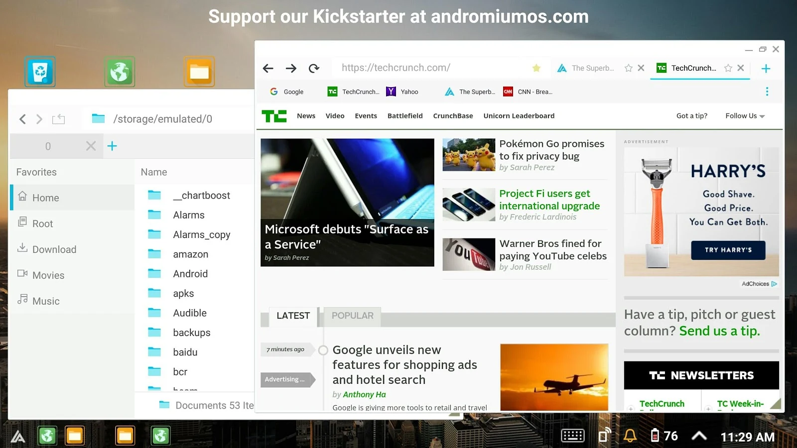
The Superbook


יום שישי, 15 ביולי 2016

Zenbot, הרובוט שיעזור לכם בעבודות הבית


מוכנים לזה?
הרובוט שיעזור לכם בעבודות הבית מתקרב בצעדי ענק.
שיהיה לכולנו בהצלחה :)

כתבה על הפן הטכנולוגי של הרובוט זנבו

זהו תוצר של פיתוח של חברת אינטל ומשווק על ידי asus


יום חמישי, 7 ביולי 2016

הסרטים על עתיד הטכנולוגיה

רשימה של סרטים שנמצאים בתקשורת עם העולם הטכנולוגי. בין אם טכנולוגיות הומצאו בזכות סרטים אלה או לא, איני יודע, אבל בטוח שהסרטים באו לפני הטכנולוגיות.
כל מי שעובד על פיתוח של רובוטים, מציאות מועצמת או וירטואלית, עוזר חכם וכו' - סרטים אלה רלוונטים עבורו.
צפייה נעימה !

נ.ב. מצגת שהכנתי בעבר על הנושא הזה: טכנולוגיות מהסרטים.

אורך מלא

Lucy, 2015
Chappie, 2015
ExMachina, 2015
Transcendence, 2014
Ender's Game, 2013
Her, 2013
Frank & Robot, 2012

Real Steel, 2011
Iron Man, 2010
Surrogates, 2009
Minority Report, 2002

קצר

Black Mirror (TV Series), 2011
Knight Rider (TV Series), 1982
Star Trek (TV Series), 1968

סרטון

Hyper Reality, 2016
Sight, 2012

יום שישי, 1 ביולי 2016

סרטון: היפר-מציאות מאת קישי מצודה


הסרטון מציג מציאות שבה גיימיפיקציה, פרסומות, עוזר אישי ממוחשב ומציאות מועצמת בעזרת המשקפיים - הם כבר עניין שגרתי. כך זה עלול להראות אם לא נשים לב.
עבודה מעולה.

by Keiichi Matsuda | km.cx
more at hyper-reality.co

יום רביעי, 8 ביוני 2016

Reality Editor, the next coolest project from the MIT Media Lab

. 
When you think augmented reality has became too wide for a research area, the MIT media lab surprises again. Fantastic job , flawless innovation.

RealityEditor is built upon openHybrid. It offers communication between augmentations and the real world objects. The objects talk together as if the augmentations are the real interface.

great job by Valentin Heun, from the Fluid Interfaces Group @ MIT Media Lab. which by the way, is the same group which gave us Sixth Sense about a decade ago.

the video shows Valentin present RealityEditor at the Augmented World Expo 2016 last week at Santa Clara, CA. 

יום שני, 7 במרץ 2016

ממשקי משתמש למערכות הפעלה ב VR / AR


בחור מוכשר בשם מייק אלגר (mike alger) חקר במשך השנתיים האחרונות את עיצוב ממשקי משתמש בטכנולוגיית VR. הוא חקר לפרטי פרטים את אופן ייצור ובניית סביבת עבודה וירטואלית בצורה הנוחה ביותר.
מומלץ מאד.

http://www.mikealger.com/

יום רביעי, 28 באוקטובר 2015

הרצאה בנושא עתיד משחקי המחשב באוגמנטד ריאליטי


מוצר לגו קופסא. אוגמנטד ריאליטי מסייעת להבין איזה צעצוע נמצא בתוך הקופסא ואיך מרכיבים אותו?
זיהוי תמונה.


?להכניס?
אנימציה ויצירת עולם על מרקר. אינטראקציה עם רוח? היתכן?
יותר הגיוני שזה עם סאונד.


החזון של התוכנית "מסודרים 2": First Person Shooter
זיהוי תמונה + פענוח מיקום GPS

http://www.youtube.com/v/wJItdmumxYY


משחק pacman AR .
זיהוי תמונה + פענוח מיקום GPS

הביצוע של AR Quake .
זיהוי תמונה + פענוח מיקום GPS


AR Drone: המסוק עם המצלמה.

שליטה בAR Drone באמצעות iPhone


משחק כרטיסי שחקני בייסבול. זיהוי תמונה (כרטיס) + מקלדת.


מרוץ מכוניות נשלט על-ידי גויסטיק. זיהוי תמונה.


ממשק המתנה מבוסס מרקרים


  משחק בפיתוח מבוסס WOW. ממשק בעזרת מרקר נוסף.


  משחק הקוביה של גיימי אוליבר. קוביות מחולקות לשלבים, הדמות נעה לפי זוית. המגרש משתנה בתוך הקוביה.


  משחק AR Worms. בחירה בעזרת זמן (המתנה של שנייה על הדמות הרצויה)

יום שני, 12 בינואר 2015

סנסורים ומחשוב לביש לשיפור הבריאות שלנו

שתי תחרויות נושאות פרסים עצומים בתחום של מחשוב לביש למען שיפור הבריאות והספורט.
זהו נושא שיש לו יתרון ברור בתחום של המחשוב הלביש, וזו הסיבה שהוא צמח להיות התחום הבולט בשנים האחרונות. 

התחרויות אמנם הסתיימו והכתירו זוכים, אבל הן לבטח יתחדשו שוב, אז תשארו מעודכנים.

תחרות של נוקיה
תחרות של קוואלקום


יום רביעי, 7 בינואר 2015

תקציר הרצאת Intel מתוך כנס CES 2015 - כל הפרויקטים המעניינים


החלקים המעניינים:
  • 7:40, אפליקצית צילום מבוססת עומק
  • 9:50, אפליקצית מתכונים ובישול עם RealSense
  • 13:40, wireless connectivity בין מחשב למסכים ומקלדות, כולל הטענה אלחוטית וכניסה ללא סיסמאות
  • 19:00, מחשב HP sprout עם מצלמת RealSense מוטמעת לעיצוב והדפסה בתלת מימד
  • 27:00, virtual floating display and holographic display
  • 29:45, הקונספט של הבית החכם
  • 31:40, שיחת וידאו בעזרת רובוט נשלט מרחוק iRobot
  • 35:20, RealSense Drone עם מצלמות ב360 מעלות שבורח מכל התנגשות עם כל אוביקט. זה הרבה יותר בטוח מבחינת התנגשות בילדים במגרש המשחקים למשל.
  • 38:45, ניווט חכם במסלול מכשולים לDrone
  • 44:10, הצגת מודול ממש קטן הנקרא Cury עם bluetooth, חיישנים, CPU, חוסך בבטריה. יועד לזיהוי פעילות גופנית ומחשוב לביש.
  • 48:00, חברת Oakly יצרה משקפיים יעודיים לגולשי סקי ולעוד ספורט
  • 52:00, מצלמת RealSense כפתרון לעוורים
  • 57:45, מצלמה מעל drone שיושבת על צמיד. פשוט זורקים את המצלמה הרחק ממך והיא תצלם את את התמונה היכן שהיא מזהה אנשים.


יום רביעי, 17 בספטמבר 2014

חמישית השנייה

200 מילי-שניות (חמישית השנייה) הוא הזמן שלוקח למוח להבין שהגוף מבצע פעולה מסויימת. כן, ישנם זמנים שבהם קורים יותר מידי דברים בגוף בו-זמנית שהמוח מתקשה לעקוב... חמישית השנייה הוא הזמן שלוקח לנו להפנים מה קורה לנו ומה אנחנו עושים.

דניאל קוק, מעצב ומפתח המשחק Triple Town (משחק מצוין שאני באמת צריך לכתוב עליו סקירה נפרדת), מדבר על עקרון זה בהרצאה מרתקת על ששה עקרונות מעשיים לאבחן משחק ולהפוך את העבודה של המעצב מעבודה לפי אינטואיציה לעבודה מבוססת/ מחקרית/ מסודרת.
למעשה כל בעל מקצוע מנוסה לומד לפתח אינטואיציה. אנחנו לא תמיד יודעים לומר למה אנחנו אוהבים את זה או לא, אבל אנחנו פשוט מרגישים שזה כך. בעיצוב משחקים הדבר הופך למשמעותי יותר מכיוון שאנו מדברים על חוויות טהורות מאד של איזון רגשי, תנועתי וחושי. קשה מאד להגדיר מה גורם למה.

עצתו בנוגע ל-200 מילי-שניות היא לעכב תחילת פידבק על אירוע במשחק בקצת פחות מהזמן הזה כדי שהמוח יצליח לקשר בצורה נכונה בין האירוע לפידבק. כלומר, אם השחקן ביצע פעולה מסוימת, הפידבק על הפעולה הזו צריך להתחיל כחמישית שניה אחרי זה כדי שהשחקן יבין שזה אכן קשור אחד לשני. 
משמעות נוספת שאני מוסיף כאן- כל פידבק במערכת חייב להמשך לפחות חמישית שנייה, אחרת המוח לא יבחין בו באמת.


אנקדוטה: שני העקרונות הראשונים מדברים על הבניית הלמידה של השחקן ויצירת למידה עקבית ונכונה יותר. עקרון נוסף מדבר על הFlow. כך שבעצם חצי מתורתו של אחד המעצבים הטובים תלויה בעקרונות למידה טהורים. מי היה מאמין שיגיע היום שמעצב משחקים נוסף ישתמש במונחי למידה בתהליך העיצוב שלו. כל הכבוד.

37 דקות ראשונות הן ההרצאה המשמעותית.

יום שישי, 23 במאי 2014

Sensibo, חברה ישראלית שתסייע בשליטה נוחה על המזגן ותחסוך בהוצאות החשמל


אחרי ההצלחה הגדולה של Nest עם היחידה ששולטת על הטמפרטורה הביתית, חברה ישראלית מצטרפת למרוץ.

לא הייתי מספר על sensibo, אלמלא הסרטון המצחיק והמושקע שהם יצרו באתר מימון ההמונים, indogogo.
חייבים לצפות.


יום שישי, 16 במאי 2014

החזון על פי מיקרוסופט- רפואה


בהמשך לסרטונים קודמים שהעליתי מחברות אחרות, הנה אחד הסרטונים ברשימה היפה של Microsoft.
כל הכבוד. מאד ריאלי, עם UI ברור, ווויה ברורה עוד יותר. 

יום שישי, 9 במאי 2014

אפילו המשקפיים האלה כבדות מידי...


חברת Meta בבעלות ישראלית, מפתחת משקפי מציאות מועצמת עם יכולת עקיבה אחרי ידיים ואצבעות.

בראיון שהתקיים לאחרונה עם המנכ"ל (http://www.bbc.com/news/technology-25616437) נראה המראיין מחזיק את המשקפיים כאשר הוא מסתכל לכיוונים שונים או כאשר הוא מזיז את הראש. זה מעיד על כך שהמשקפיים כבדות לו לתנועה חופשית.

חשוב לציין שאני לא מתלונן על החברה או על המוצר. החברה הצעירה התקדמה בצורה מדהימה בשנה וקצת שהיא קיימת. יש להם היום משקפיים דקות למראה, עם מצלמה תלת מימדית קטנה מאד (עדיין יקר, עולה 3700$ בערך). אני מאחל להם הצלחה בדרך.

לפני כמה שנים כשפיתחתי את ARIE, המשקל של המשקפיים התגלה כנקודה כואבת ביותר למשתמש. עד שהן לא יהיו קלות מספיק, הן יחשבו כאביזר חיצוני המצריך מאמץ והמשתמש יעדיף לוותר עליו. 

יום ראשון, 23 במרץ 2014

Tactical Haptic, פרויקט שמאפשר לקבל פידבק של התנגדות דרך השלט


חברת Tactical Haptics שהחלה כפרויקט kickstarter הונפקה והצליחה להגיע למוצר.

הסרטון הטוב יותר מציג התקנים נוספים וצורות אחיזה ריאליסטיות יותר, כמו: רובה, חרב, ואפילו אפשרות להלביש את הטלפון או הטאבלט על ההתקן כדי לייצר חוויה שלמה יותר.

יום ראשון, 6 באוקטובר 2013

Diamond Dash: great instructional design for the onboarding phase!

Diamond Dash by Wooga is one of those casual games that didn’t seem addictive to me because its simple basic mechanics. "Just find three or more similar items stuck together and click it. How much fun can that be?", I asked myself. But after I started the game I realized that what's really great in it, is the way the game teaches the player about the other possibilities of it.

JUMP RIGHT INTO THE GAME


The game starts with a simple welcome screen and one instruction of "Remove 3 or more similar gems in 60 seconds". It jumps right into the game. No story, no huge level selection, no introduction videos. Jumping right into the game is well-accepted as a good way to please first time players, but at the same time hard to do well. I believe Wooga nailed it there.

SCORE -> LEVEL -> SECRET


By the second game you get a level up and understand the importance of scoring and its connection with your levels. You do not yet understand how leveling is important to you though.


Each game or two, you pass another level. Each level you get a new Secret. This is the way Wooga teaches the player about the interface and the possibilities of the game: both social and gameplay. After the first level, e.g, you get to know the concept of Magic Fire.

HEARTS ARE KEY TO PLAY


By the third game, you understand that each time you play, you lose one heart. This is the first social lesson you get, because later on you would understand how you can get new hearts from the help of your friends.

SOCIAL GAMEPLAY IS KEY TO USER RETENTION


By the fourth game you get to know about the weekly tournaments. These occur between you and your friends (only people you know). Best three top scorers of each week get a reward. You get free hearts if you invite your friends to connect with you on the tournament. That's something you easily see through the interface, without the need to introduce or talk about. The weekly tournaments answer two big design challenges: how to make the player come back to the game over and over again, and how to give them hope they can get the first place.


MONETIZATION


After the fifth game, you run out of hearts. This is when the panda introduces the element of gold bars. These can buy you lives, you see. The panda gives you 9 gold bars, which are just enough to get 5 more hearts. Obviously, this leaves you inside the game for 5 more plays…

On the sixth game, you get to level 4, you are rewarded with gold bars. This is done to remind you of that concept, to make sure you don’t forget it. And you are presented with another secret of the gameplay: Magic Diamonds.

CONSTANT CONFLICT: HELP VS COMPETE


By the ninth game, two games before the end of lives, you are reminded to get more hearts. It is summarized really simply: no lives means no more play, and there are two ways to get it: buy them with gold bars or ask your friends. Then you realize that you need to be nice with your friends, in order for them to be nice with you. This is actually a great conflict the game poses to the player: be nice to your friends and give them lives versus compete with them on higher scores in the tournament.


At some point the panda doesn’t come back. I almost didn't notice that, and I see this as a design wonder, because the entire interface changes from a cute panda giving me lives and gold bars into a more "professional" look of tournament scores and countdown clock.

CLOSURE

To conclude, Wooga's Diamond Dash is an addicting social based game. Its not the gameplay that keeps you inside, it’s the social elements of it. The instructional design of teaching the mechanics to the player is one of the best I've seen because it is being revealed to the player one step at a time. It is constantly being simplified and adjusts itself to the level of the player.